Sunday, October 30, 2011
Friday, July 22, 2011
Raw Scans of Black and White Art
Friday, July 15, 2011
Creating an "Immaculate Reality": Researching History, Applying Technique, and Creating a Fantasy

For this personal project, I'm setting the scene in Chicago circa 1921. I needed to use a grand theater to open the narrative, and my research led me to The Chicago Theatre and the movie palaces of Balaban and Katz. Like most artists today, I start with searches on the internet. My initial search was for Chicago theaters 1920.
After finding some images of The Chicago Theatre's exterior and interior from 1921, I composed a page by warping and scaling the images in Photoshop, and printing the composition in the method I discuss in my previous posts. The 1920's have always been an obsession, and it is important that the work I do be informed by an understanding of the period's history. When I began my research, I had no idea who Balaban and Katz were, and on top of that I had two low resolution images of an ornately detailed theater that I wanted to use as a backdrop.
The next phase of my research led me to the book "The Chicago Movie Palaces of Balaban and Katz" by David Balaban. What I found in the book is the real research. Everything surrounding the creation of the theater and the people behind it. I also had the high quality images I needed to bring the setting to life.
Above is the page in its initial phase. The final illustration will require that the scene take place at night, and will require a change to the lighting of the reference image I started with.
Wednesday, June 22, 2011
Digital+Traditional Media and How I Experiment

The poster was printed onto a 11 inch by 14 inch sheet of Canson Bristol Paper on the textured surface side using an Epson Stylus 1280 printer. The color is being applied using Pelikan opaque watercolors.
This initial phase of work is not too precise and is largely about reigning in the value and color. The background work was done in order to lower the contrasts and make the overall value lighter, while the foreground elements were darkened to try to add to the depth. The color, specifically the bright reds and warm notes in the background have been cancelled out with less vibrant colors to allow for the distant ship to appear farther away.
The key elements to notice are the figure's darkened back arm and tattered fabric against the water with less contrast. The color of the arm has also been made a warmer reddish hue that allows for it to pop off the greener water.
I was also able to track down the original promotional photo used to create the poster that I will use when I work into the figure with more detail.
Wednesday, June 15, 2011
Warming Up and How I Work

For this work, I scanned in the ancient photocopies of some of my college work, printed them in a very light grey on the Canson paper, and now I have a pristine surface that is ready to be inked and have additional pencilling done on it if need be. If this was a comic page, I would be doing the same process with my rough layouts being enlarged and printed instead.
Following this part of the process, I use Faber-Castell PITT artist pens. I tend to use the range of grey brush-tips that they make, starting with WarmGrey III 272 and then Cold Grey 232, and a dark grey (235). I use the black brush-tip as well as the black size XS pen tip (the smallest size). The panel borders are done with a black size S pen tip.
What make these pens so extraordinary is the fact that the PITT artist pen's ink is waterproof and does not bleed or smear when I lay washes of opaque watercolors over my ink lines. The pens also allow for the paint to absorb into the paper under the ink, which waterproof India Ink resists. If I want to add additional lines (and I always do) over the washes once they've dried, the pens do this with ease. I always use a blowdryer between washes for technical work to speed up the drying process.
This brings me to the paint I use on all my illustration work: Pelikan Opaque Watercolors (24 set). On images like this, I use only the black and mix it with a tube of "Zinc White" Windsor Newton Designers Gouache when I want an opaque grey. For images like this, where I'm not doing large washes, I use a round-tip Cotman watercolor brush size 2 or 3.
I also use that same tube of white to hatch into darker areas and line with white using a small round-tip watercolor brush size 0.
The image above is on a 9 inch by 12 inch sheet of the Canson paper.
Wednesday, April 27, 2011
"The Gunsel Geist" Final
Saturday, March 19, 2011
Monday, March 14, 2011
Shanth Enjeti Circa 1998


My senior year in college I created a lot of work outside of homework assignments to showcase my abilities as a draftsman and sequential storyteller (such that they were my senior year in college). When I tell my students that I did not have a cell phone (not to mention a "smart phone") and that the only way anyone would see my work was if I mailed it to them or showed it in person, it always amazes me how different the world is today.
I had not taken a digital class when I graduated and I did not own a laptop or computer. I used photo copiers to reproduce my work, and this is an example of what I would mail or hand to editors my senior year (1998). Looking back at these pages of sequential art, it is amazing to me how far things have come. These pages that showcase a battle of a cyborg "Stonewall" Jackson and a heroic Abraham Lincoln make obscure references to Civil War history and used technology inspired by locomotives that seemed absurd to many teachers (not all) and made little sense to editors at the various publishers of the day.
If I had been creating this work now, invariably I would have showcased it on the internet and had an understanding that I was making work within a genre that even in 1998 had a name: "Steampunk."
There is something extraordinary about this current age in which we are living where there is an audience for any idea available and accessible to the young artists and creators of the world. Of the work I completed while at college, these pages stand as my favorites. It seems appropriate to let them see the light of day (or the screen) as a tribute to my affection for them.
Wednesday, February 16, 2011
Nicholas E. Jainschigg Painting Blog

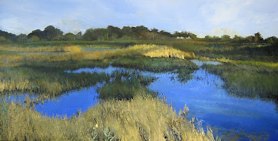
My dear friend Nicholas E. Jainschigg, a fellow teacher, landscape painter, and the artist I share a studio with, has started a blog showcasing his incredible landscape paintings. He's put the first image up, and it is one of my absolute favorites. You can visit the blog by clicking HERE.
Sunday, January 30, 2011
In "The White Room"
The photos below were taken with my iPhone in the studio that Nick Jainschigg and I share that we have dubbed "The White Room". With our hectic schedules, we're seldom there at the same time, so it was a rare treat to have the opportunity to swap recent book acquisitions and converse between sessions at the desk and easel.
My desk.

Nick's landscapes viewed from the white sofa.
Wednesday, January 26, 2011
Wrapping up "The Gunsel Geist"

I'm currently wrapping up this image that is an idea I had for a serialized sequential story about a pulp hero that takes place in the 1920's. The original finished art will be on display at the RISD Faculty Biennial in the RISD Chase Center this February.
Below are two posters that inspire the illustration pictured side by side.
Sunday, January 16, 2011
UPDATE
Hello everyone! Just wanted to let you all know that this blog will be expanding, and that as of 2011, my website at Shanth Enjeti dot com is no more. This location will be my main web presence, and I will be updating the above sections in the following weeks.
In addition, my educational web log TellForward will be expanding as well!
Namasté,
Shanth
In addition, my educational web log TellForward will be expanding as well!
Namasté,
Shanth
Subscribe to:
Posts (Atom)


